Baiju Solanki
I’ve known Baiju for years - we met in the school playground dropping our kids off. Since then he’s become a good friend and we’ve worked on a lot of projects over the years.
He recently came to us about a re-brand so we wanted to do him proud.


The Process
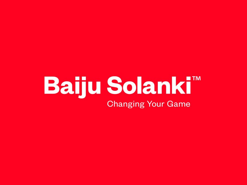
One of the things I realise more and more as I get older is that simplicity is everything. A brand doesn't need to be fancy, all-singing, overly clever (it can be, but it doesn't NEED to be). It just needs to be memorable. Decent type, amazing colour...it’ll stand the test of time and look good in 10 years time.
We chose a strong sans serif typeface call Founders Grotesk that has fantastic legibility and a few quirks in the letter structure to make it interesting. We coupled that with a super-punchy red to really grab the attention - Baiju works in a saturated marketplace so we needed something that would make people take notice.
We introduced the overly bulbous ‘B’ that can sit enigmatic style as a shape or can be filled with photos/portraits or whatever.