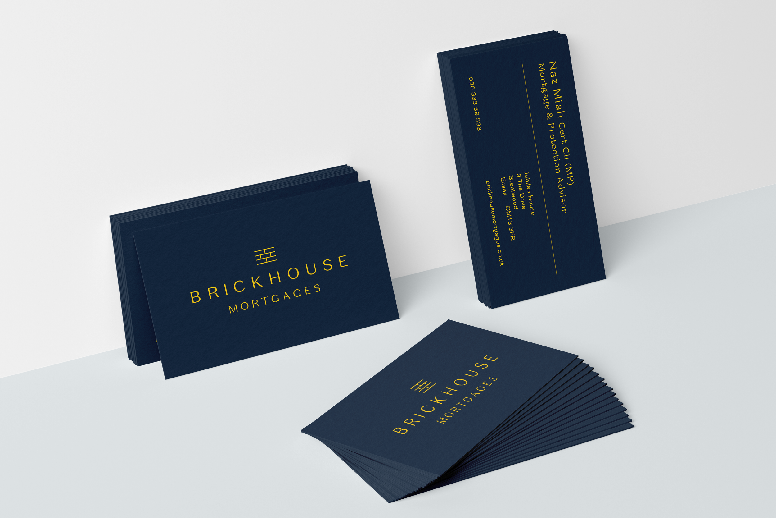
Brickhouse Mortgages
A warm and friendly financial start-up that looks to create something different in the over-saturated mortgage and homes sector.


Timelapse
Oooh…saucy time-lapse of Brand Guidelines being put together…
The Process
We wanted to push aside all the overly dense, complex and often dry looking brands that accompany the financial industry. Naz (the Director of Brickhouse) wanted something that looked slick and yet welcoming - his idea to create a new open, honest and trustworthy business that could help people start the next chapter of their life.
We chose a typographic approach using a beautiful font with an airy layout. Using a simple brick ideogram added a simple and yet powerful marque that over time will slowly become an integral part of the brand.
Initially we started with a strong midnight blue and accompanied it with the warm yellow. After some simple audience research it became apparent that the yellow really resonated with customers giving the best of both worlds - a corporate blue for B2B with a playful yellow for the consumer market.
We produced some simple illustrations to accompany the themes and messages directed at consumers rather than rely on stock photography.
The finished look is simple, charming and with a splash of quirkiness.


