Gourmet Deli
Taking inspiration from the finest French boucheries the brand identity for The Gourmet Deli Co was designed from the start to have a big impact. The owners were taking over an existing delicatessen on Leigh Broadway and wanted to make an announcement that this was a new deli, with new owners and have a new ethos.


More Info
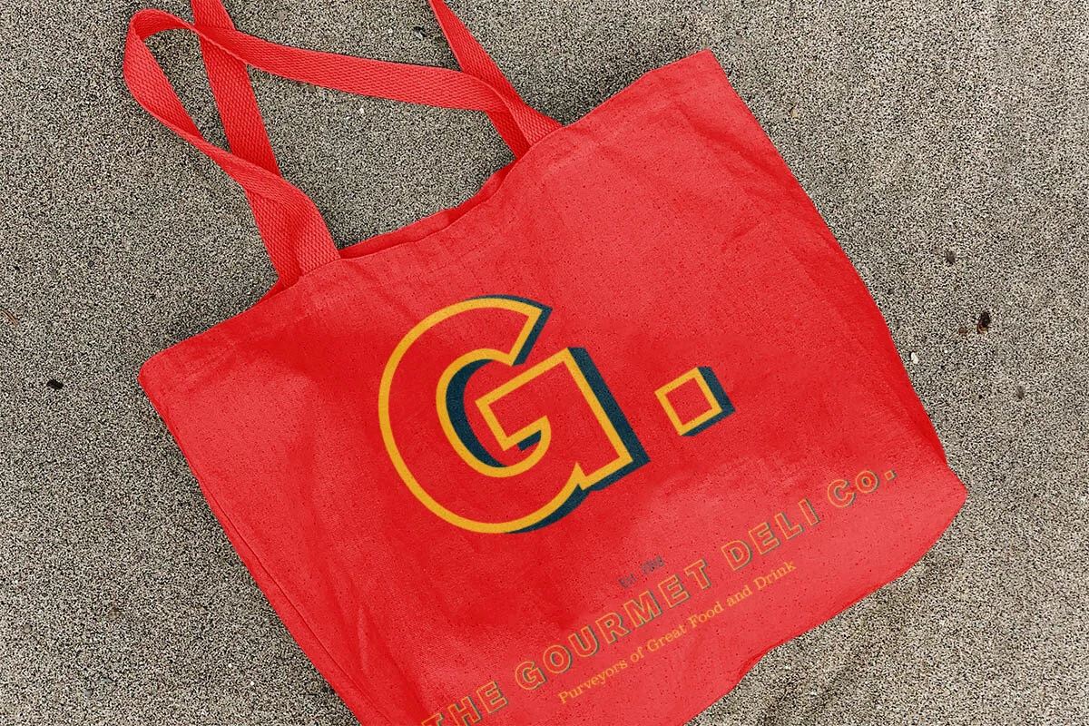
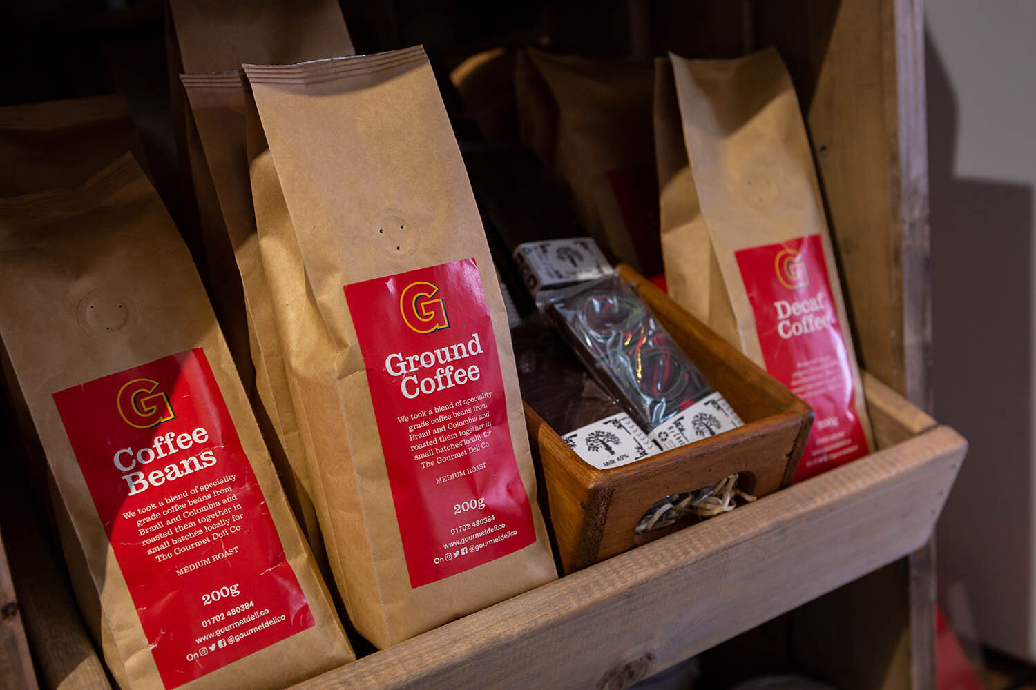
Red is a bold and warm colour, and is also used to stimulate the taste buds so it seemed like a good choice. We wanted a simplicity to the design, so chose some classic typefaces (Akzidenz and Clarendon font fans) with enough heft that would make a statement to match the colour.
We worked on alternate versions of the logo with culminated in a dominating and monolithic 'G' that punches above its weight and claims local ownership of the letter.
Originally we planned to paint the shop brickwork red (in another nod to French market towns) but decided instead to go for a more neutral grey that allows the impressive signage to dominate the fascias of the parade. The result is pleasing to the eye, makes a bold statement and yet still blends into the surrounding area without overpowering it.
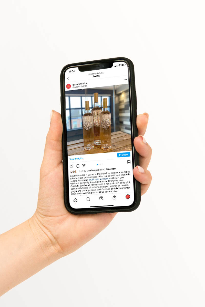
Once the design was finalised we set about sorting the photography (shot by Matt Crew) and video, to really make the mouth water over the lush charcuterie, fragrant cheeses and other deli related deliciousness.
What People Are Saying
“Whatever it is, the way you tell your story online can make all the difference.”
— Quote Source
“Whatever it is, the way you tell your story online can make all the difference.”
— Quote Source